Typeface Design, Colour theme design
Visual Hammers for developers
Team members
Yan hao(Project manager) Emily Liu Yawen Lu
Role
Design/User research, Collaborate in designing hi-fidelity prototype, User testing strategy
Category
Typeface design, IDE color theme design
Background
As a team of designers serving developers in Huawei, we have been doing UX design for different products from various development teams. We usually design the UI that best matches the interface style of the products, and we never had our own design languages. Since the new manager was promoted 2 years ago, we began to put forward our own design propositions, advocating that each product should be developed according to our style. The typeface design and the colour theme design are part of our design proposition strategy, we call them visual hammers. Visual hammers is a theory proposed by American marketing experts Laura Ries to deepen consumers' memory through the most effective combination of words and images. The nail represents words, and the hammer represents visual images. Currently, our products designed for developers lack visual hammers.
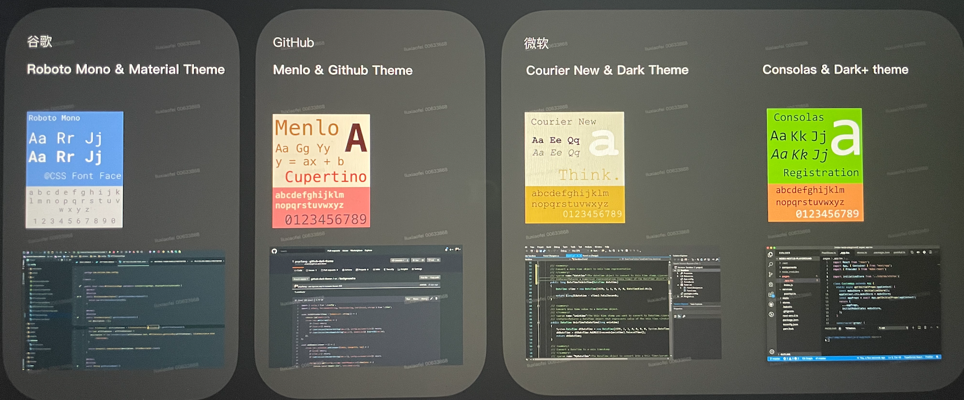
Compared with leading software companies, Google, GitHub, and Microsoft have all launched their own visual hammers for developers.
Design Goal
Design language proposition
IDE product’s visual hammer
Spread Company brand awareness in software products
Keywords: Recognizable, usable, aesthetically pleasing
The Users
Short-term: PaaS engineering teams as enterprise-level design
Long-term: Publish and spread to every developer
Research Strategy

Typeface Design
Competitors

We did a simple survey on coding typeface preference, and statistics have mentioned 21 monospaced typefaces in total. From the top selected typefaces, we collected the reason and found that a popular code font has the following advantages:

Monospaced (a must): each character is equally spaced

Rounded outline curvature: common reading fonts have narrower corners.
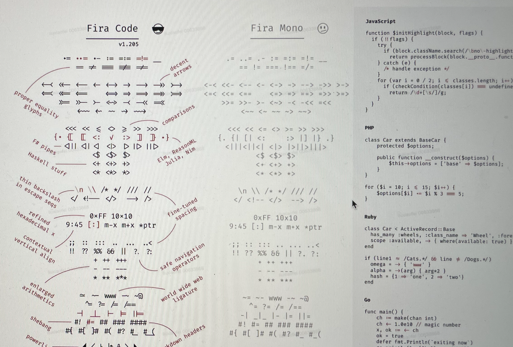
Rich ligature library and multi-language characters: The support of ligatures can make the code look more clean and tidy, and at the same time symbolize common code combinations, making it easier for developers to read.
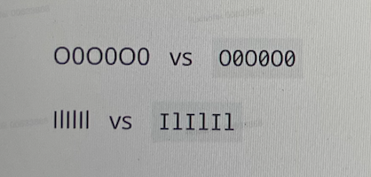
Easier recognition of characters that are usually easy to misread: 0oO / Ll1 / nm / CG/ 9g /...

More minimalistic and exaggerated punctuation symbols: Have simpler strokes and more prominent features than in common reading fonts.
Design research
Legibility
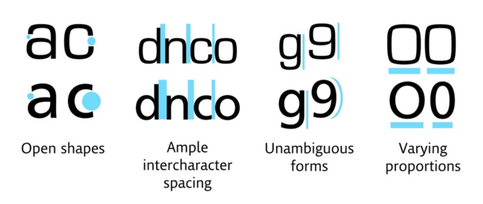
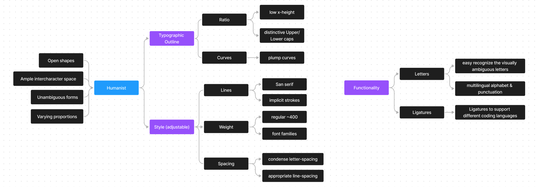
Legibility is a very important part of coding scenarios. According to font legibility research, scholars judge fonts according to four dimensions: Open shapes, Ample intercharacter space, Unambiguous forms and Varying proportions. Typefaces that all conform to the standard are called humanist, and those that do not meet the standard are called square grotesque. Fonts that are closer to humanist are easier to capture and read on multi-text displays.
Reimer B, Mehler B, Dobres J, Coughlin JF, Matteson S, Gould D, Chahine N, Levantovsky V. Assessing the impact of typeface design in a text-rich automotive user interface. Ergonomics. 2014;57(11):1643-58. doi: 10.1080/00140139.2014.940000. Epub 2014 Jul 30. PMID: 25075429; PMCID: PMC4267594.
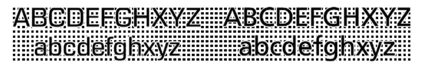
The top-line characters are a square grotesque design (Eurostile) and the bottom line a humanist design (Frutiger), highlighting various characteristics thought to improve legibility.

This illustration begins on the left with a very closed aperture of a square grotesque design and progresses to the right with more open apertures found in the humanist sans-serif genre. Note: The letters are all displayed at 100 point – no adjustments have been made to regularise their height.
The fonts were constructed to have equivalent letter heights based on the capital letter ‘H’ in line with ISO 15008 standards for defining automotive font sizes. The square grotesque typeface (Eurostile) is on the left and humanist typeface (Frutiger) is on the right.
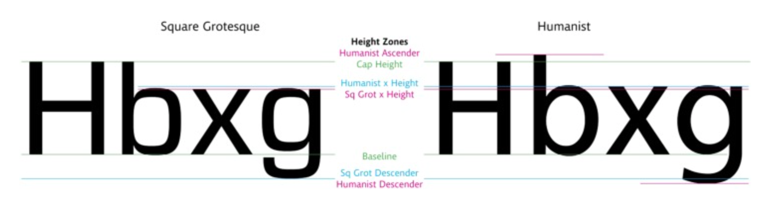
Subtle differences in the heights of other characters may be present when fonts are normalised around the height of the capital ‘H’ reference standard. The square grotesque typeface (Eurostile) is on the left and humanist typeface (Frutiger) is on the right.
We strictly compared the competitor typefaces with the standard, the top popular typeface design matches the standard which belongs to the legible humanist typeface family.

Typeface design rules
The font looks like there are only some letters that can be designed on paper by hand, but the design needs to be adjusted according to the specific principle of the typeface design.

User research

To gain an in-depth understanding of the developer’s visual preference for typeface, we designed survey questions based on the typeface design principles.
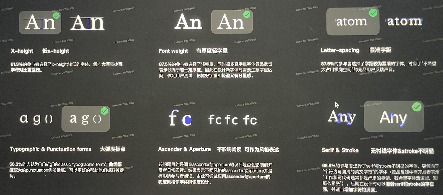
We interviewed 12 software engineers from the PaaS department, the results indicated:
X-height:81.3% of the participants chose fonts with a lower x-height, tending to have a stronger visual contrast between uppercase and lowercase letters.
Font weight:87.5% of the participants chose a weight with a thickness of 300-400 weight
Letter-spacing: 87.5% of the participants chose relatively compact letter-spacing because it would not occupy too much horizontal screen space.
Typographic & punctuation forms: 56.3% of people think that the classic typographic form of "a&g" and the punctuation with larger curves, can better help them capture keywords.
Ascender & aperture: Different styles of Ascender & Aperture do not affect reading and can be used as the main design style expression.
Serif & stroke: 68.8% of the participants chose serif&stroke fonts that look less obvious and simpler.
Design Solution


Colour Theme Design
“These default colors help me differentiate software. There may be a psychological impression that I think this software is what I want. My default settings for VS code will be preconceived, unless its default color scheme is particularly ugly, and if it is not ugly, I will generally use the default color scheme. When I came in, I knew I was in VS code, and when I opened Sublime text, I knew I was in Sublime text. If I change the theme color, I am not sure which software I’m using”
an anonymous developer
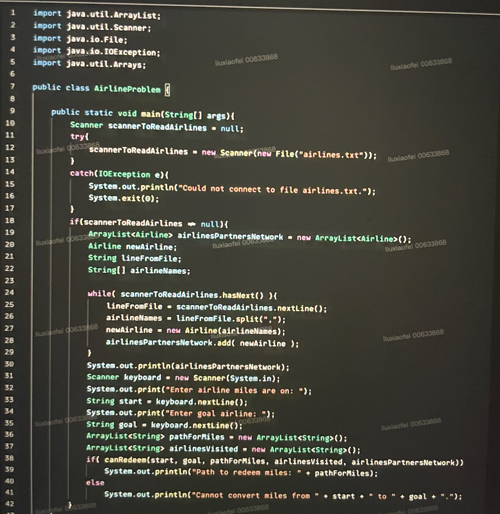
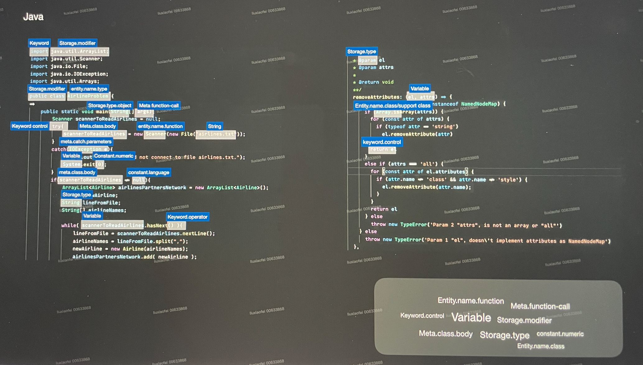
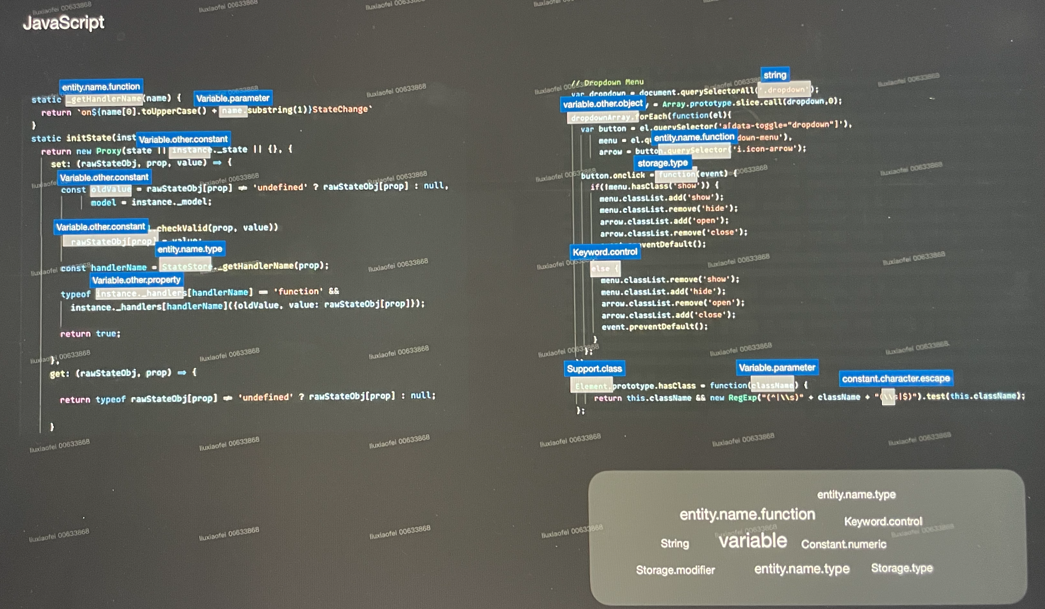
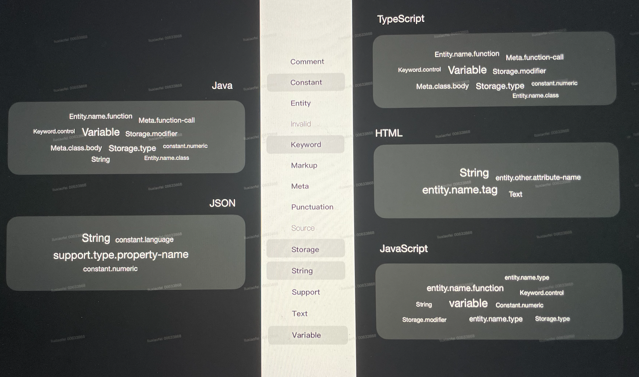
All the programming languages we know can be classified into token types, and the colour of the token will be uniformly defined in a JSON file through the Semantic token scopes. We can customize the colour of the specific code according to the scope.
Scope can be called a scope selector, which is a selection mode like CSS language, the difference is that we use TextMateRule for advanced customization.


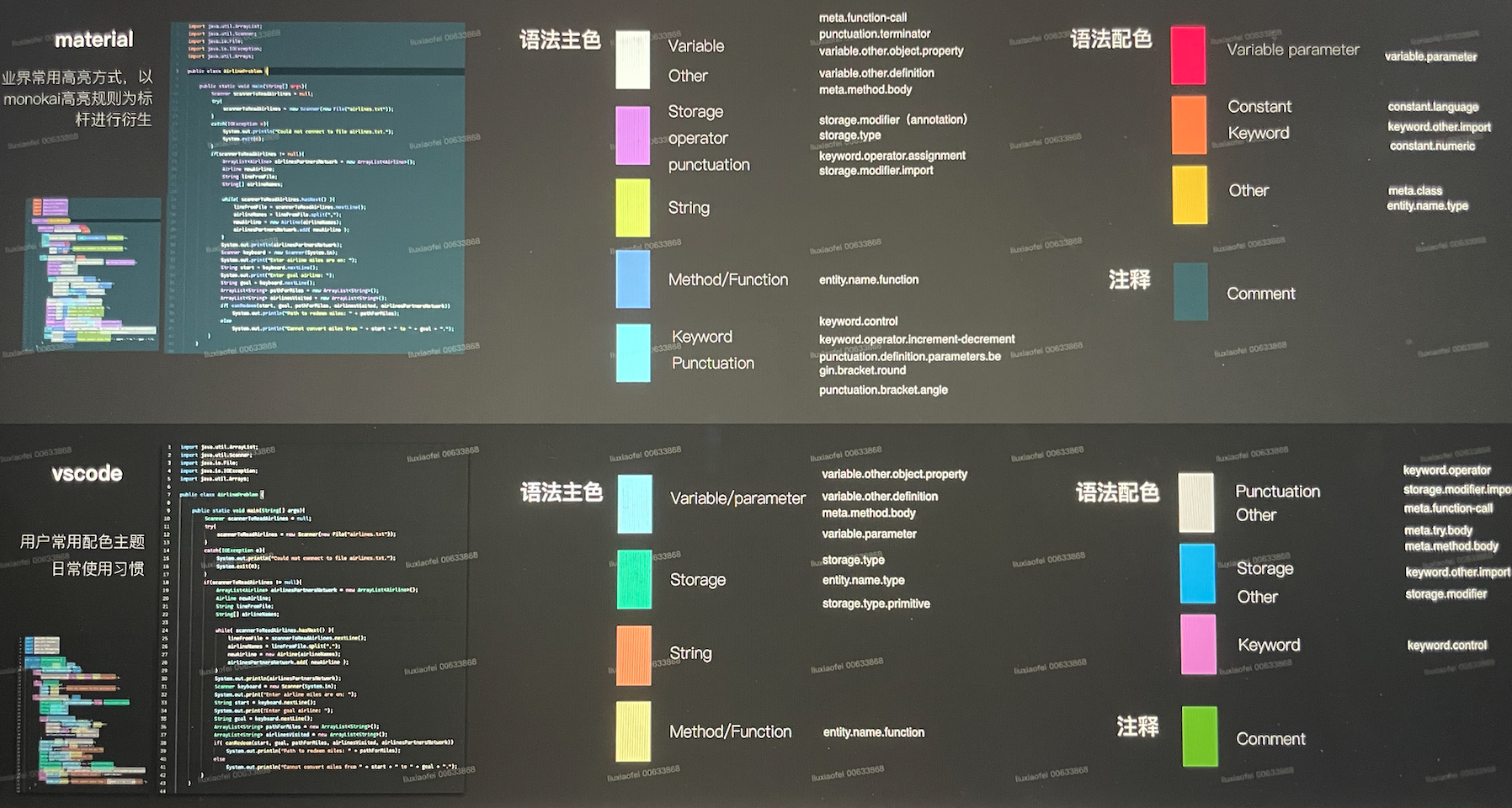
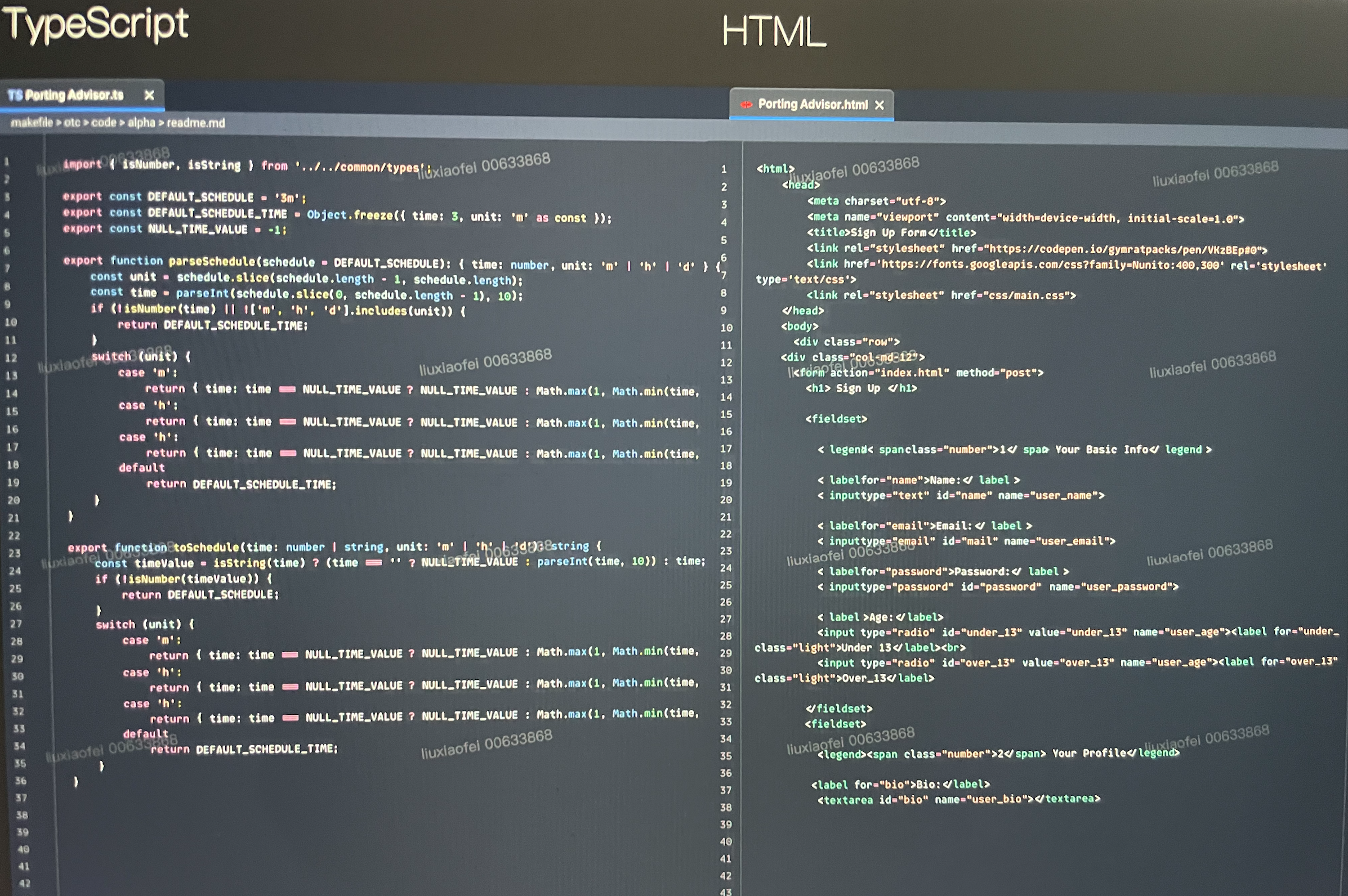
With one customized JSON file, the scope can apply to the colours in all types of programming languages automatically. This is a sample of the most popular theme Monokai Classic result in multiple languages.
How do we ensure that the visual colour palette looks good in every language?
We count the scope frequency in each language. manually.


We know the method of filling colour, what colour is suitable for Code Editor colour matching? Do developers pay attention to colour?
To know this information, we interviewed 8 developers about colour.
6 of the eight interviewees were male, with an average development age of 4 years, covering front-end and back-end language development.
The languages used for the front end are JavaScript/Typescript, and
the languages for the back end are Java and PHP.
We explored the need for colour usage from three directions:
Theme colour preference and personal preference: understand the developers’ colour theme usage tendencies.
Grammar distinction: Understand common syntax highlighting habits and the impact of existing market colour schemes on users.
Theme colour exploration: With the support of colour models like HSL HSV, understanding users' feelings on different theme colours.
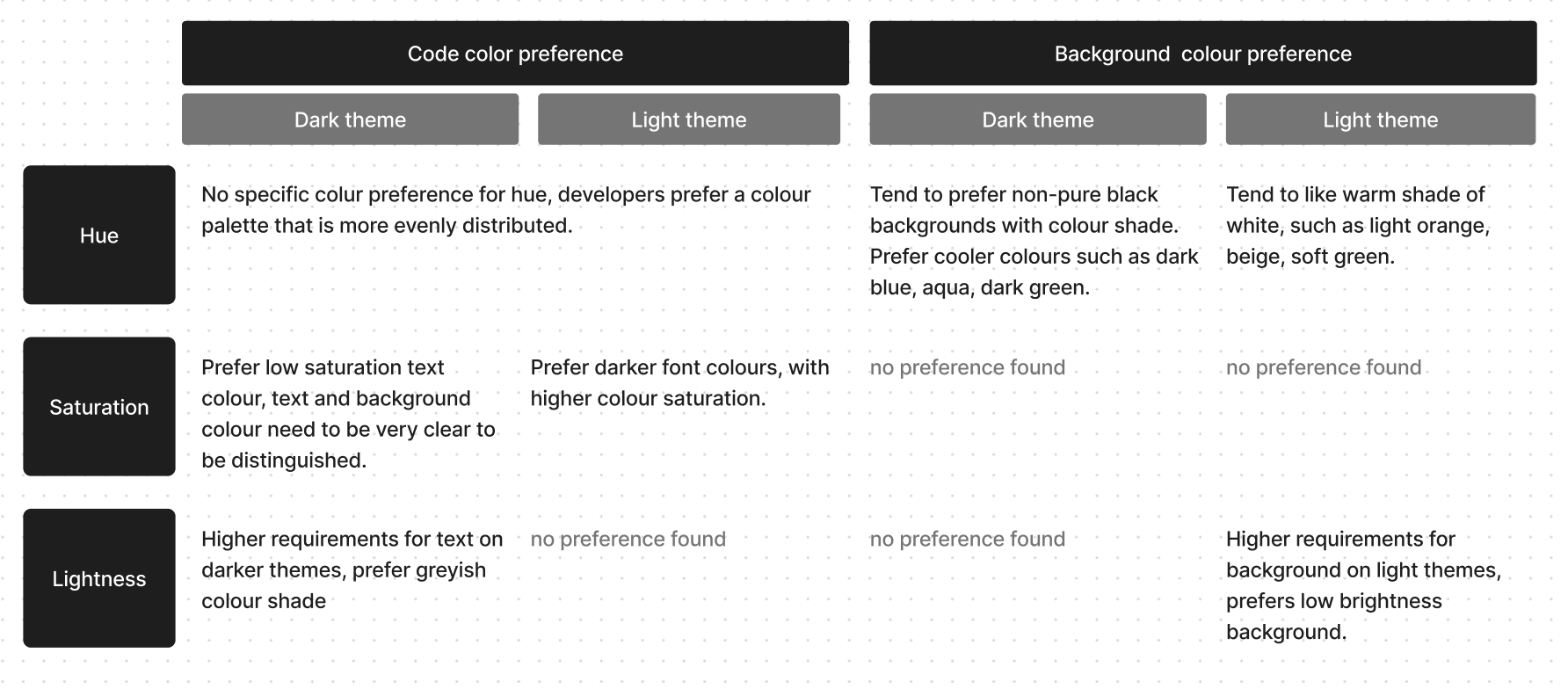
Theme colour preference and personal preference
As the results
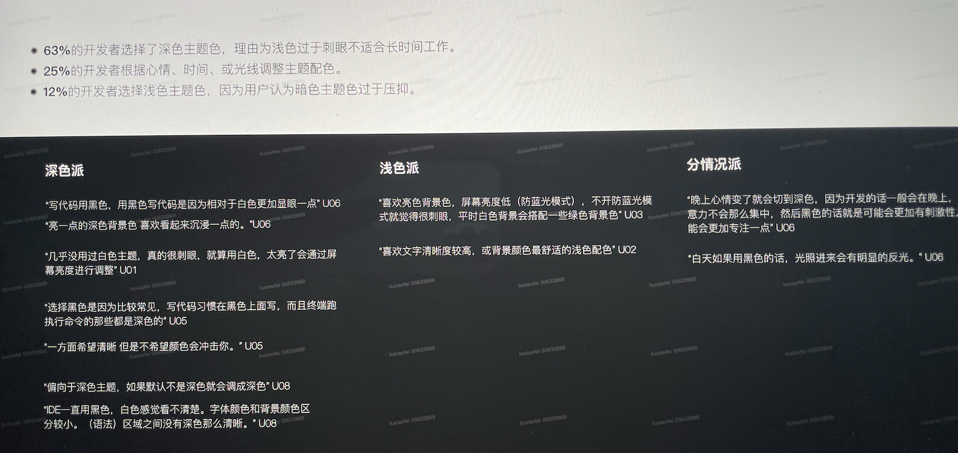
63% of developers chose dark themes, mainly because light colours are too dazzling and cause eyestrain, not suitable for long-term work.
25% of developers freely adjust the theme according to mood, time, light and other factors.
12% of developers choose light themes because users think dark theme colours look too depressing.
The colour theme most of them currently in use is the default vscode or IntelliJ theme.
What are the other themes they might prefer?
We found the top 30 theme colours in the most popular ranking in the current market, and let developers choose their favourites.
We found the following facts:
Preferences were similar across genders.
The popular theme colours all have the characteristics of even colour distribution.
Colour and the corresponding syntax have a hierarchical relationship.
Colour developers with dark backgrounds that are too dark have the least acceptance.
Developers pay attention to functionality, developers will notice the grammar highlighting of the theme, and select if the colour conforms to their development habits.
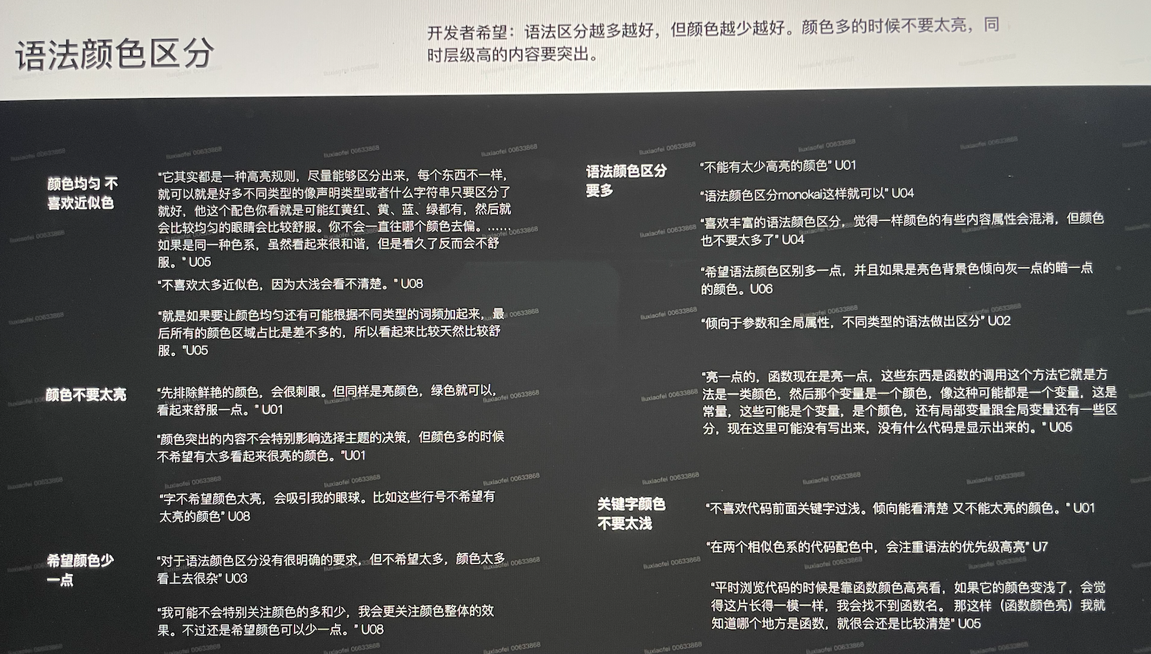
From the interview, we found that:
the developer hopes that the more distinctions the better, but with minimal colours.
The colours can’t look too bright, and the important scopes need to stand out with hierarchy.
Grammar distinction
According to the developers, we summarize the relationship between the colours and semantic scope tokens, then compared our findings with the most popular themes(vscode, material) which match the spectrum.


Theme colour exploration
We want to understand users' perception of theme colours outside of daily use.
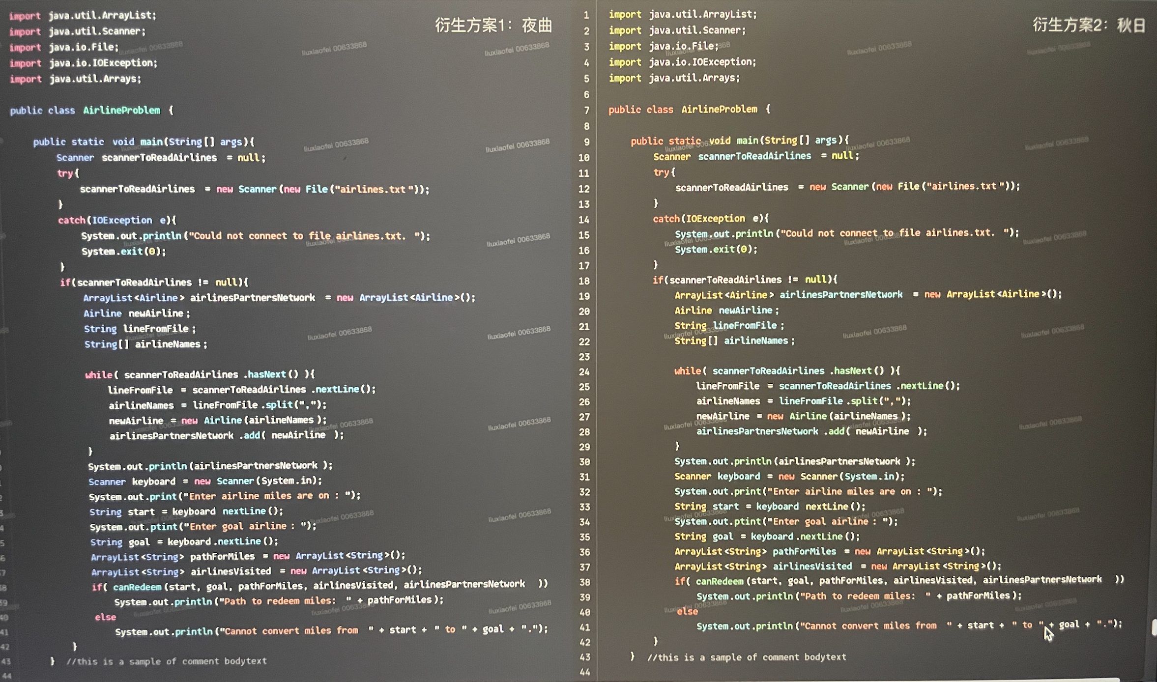
We processed the picture materials for interviews based on the most classic Monokai Theme with different colour parameters. From the HSL colour model to inspect the theme colour preference.
Key findings:
Design Solution
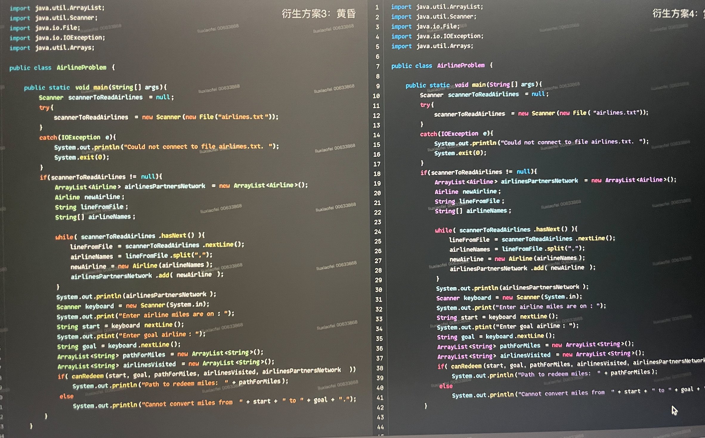
With the findings from the 3 perspectives mentioned above, we came up with the initial designs.


- The End -