Travel to Yunnan: Smart Travel App
How to make tourists in Yunnan travel smarter and faster?
UI/UX Design + Mascot Design
Our team intends to optimize the version 2.12.0 of the “YouYunnan“ App into the next stage, which requires both UI and UX redesign based on our innovative brand proposal.
 Team member
Emily Liu Yucca You Cyan Feng
Role
UX/UI designer — Ideating, Visual Research, Mascot design, User Interface design
Duration
12 - 26, August, 2019 (2 weeks)
Tools
Sketch, Illustrator, C4D
Category
UX/UI Design
Background
“A mobile phone tour in Yunnan” is a tourism intelligence platform jointly created by the Yunnan Tourism Development Committee and Tencent. “A mobile phone tour in Yunnan” is positioned to rectify the chaos in the tourism industry and promote the upgrading of the
tourism industry. It will use the Internet of Things, cloud computing, big data, artificial intelligence and other technologies to create a smart, healthy and convenient provincial-level global ecological tourism project for Yunnan Province.
Interaction redesign
The Root of the Problem
From a product point of view, the biggest problem with this app is it’s unclear positioning: it seems that it wants to do food, drink, entertainment, and accommodation, and it is mixed with many unnecessary functions. (Such as hotels and flight tickets) It is challenging to compete with other existing platforms on the market, such as Ctrip. Then, where is the competitiveness of Yunnan?
Existing Problem
- Unclear product positioning
- Core strengths are not highlighted:Offline hardware servicesLocal real-time dataInformation source accuracyGovernment guaranteeUnique local cultural
- Other features are challenging to compete with the market.
Product Positioning
Guarantee + convenience
Official service and consulting assistant for online and offline experience
Goal
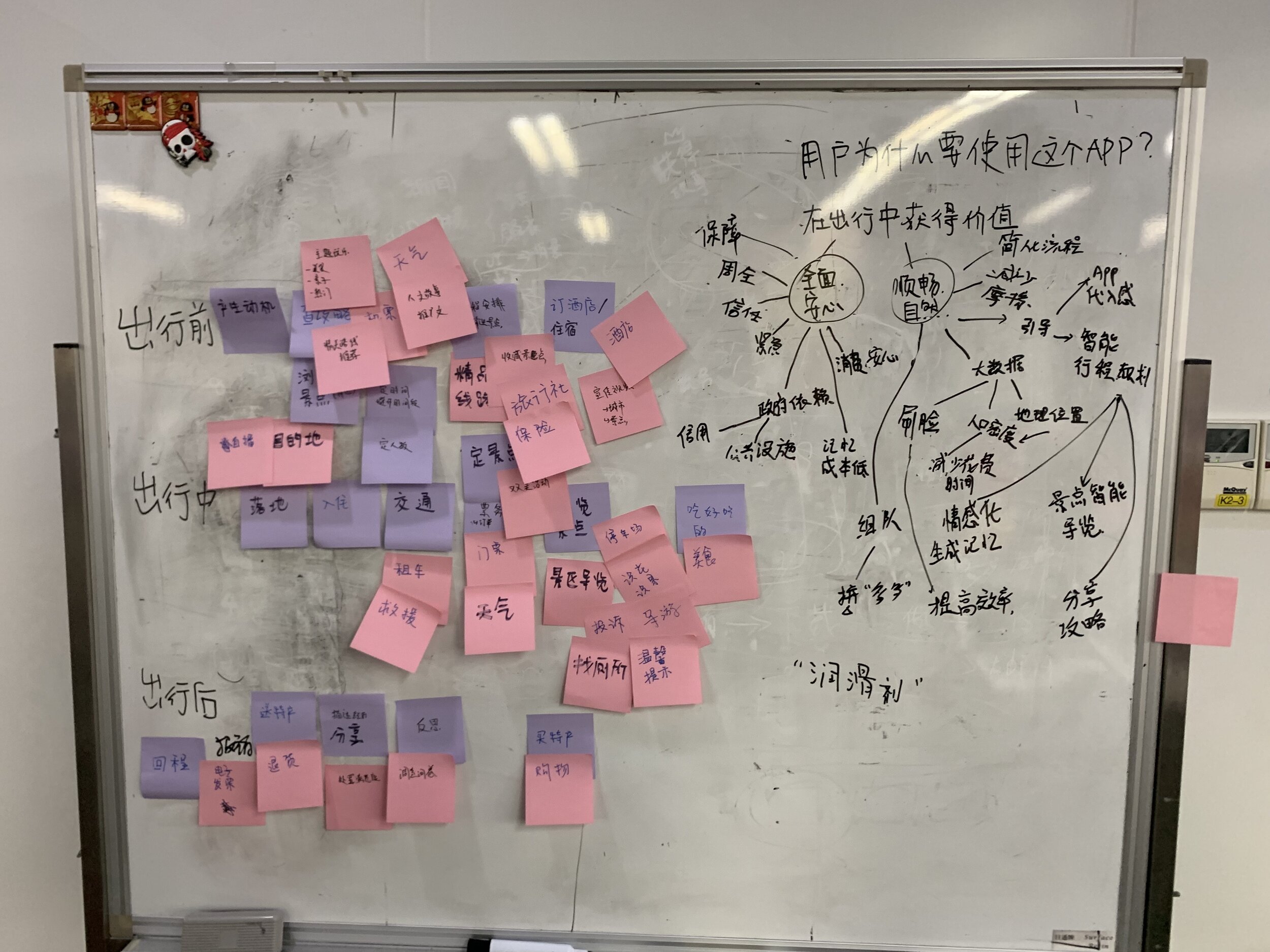
Have a profound understanding of Yunnan tourists’ behaviours, thoughts, feelings, pain points and opportunities during the whole trip.
Research Tools
Research Interview, Journey, vlog
User Research
Persona
Free traveler
- Use of local autonomous services
- Self-driving, bus, charter
- Have certain autonomy in choosing attractions and plan itineraries before trip, adjust the schedule while traveling
- Faced with many uncertainties during the trip
User journey map
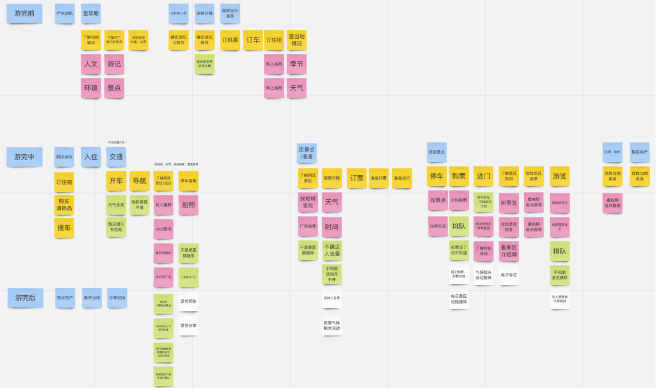 Opportunities
Uncertainty
“uncertainty of weather”
Weather
“I will worry about the bad weather before the ropeway can be opened. what can we do besides ropeway? and is it worth it?”
Information Platform
“When I arrived, the tickets are all sold out! Then I found all the info updates are posted on Weibo, I don’t even have a Weibo account.”
Traffic
“If I knew there are people queue up and waited for hours, I won’t come at first “
Research conclusion
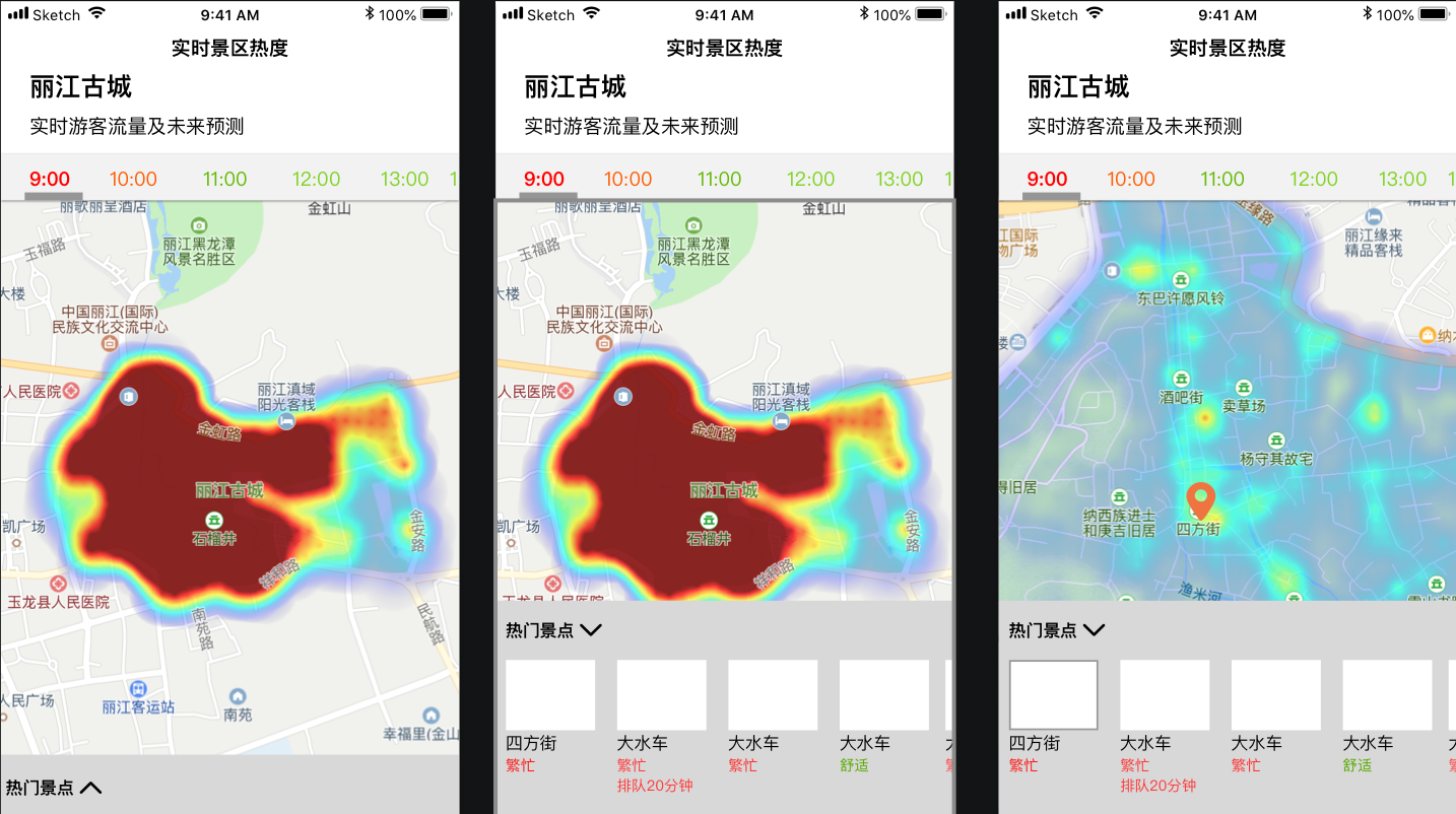
- Solve the messy, inaccurate information update sources, and help users make travel decisions
- From weather, travel flow and real-time notification, three aspects, to use big data and local scenic service to help users summarize real-time updates and generate predictive information.
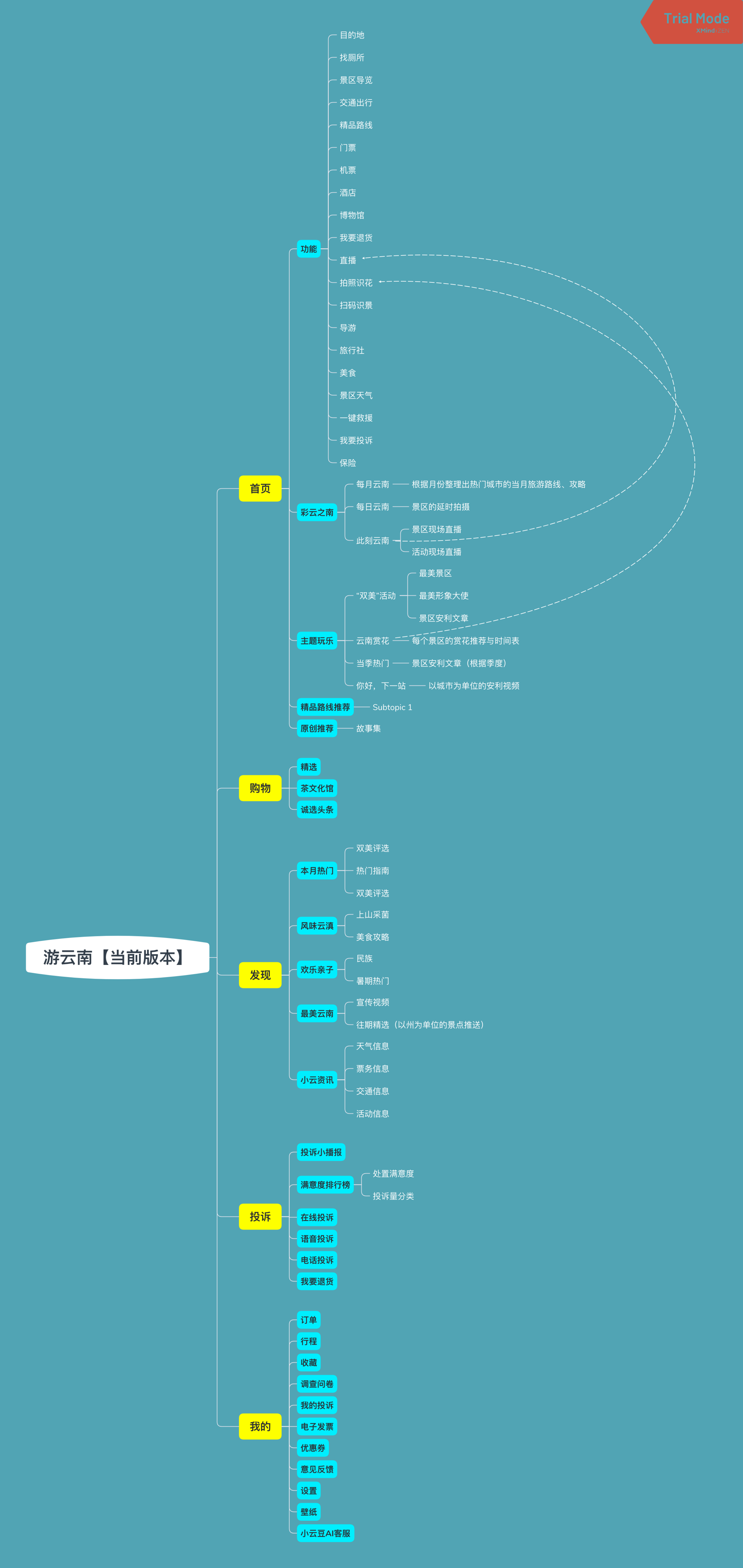
App Structure
Current Problem
- The app structure is disorganized and functions are not user-centred.
- Too many similar functions.
- The online and offline experiences are scattered and incoherent.
- Decentralized and disconnected online and offline experiences.
Objective
- Streamline app structure.
- Create a beginner-friendly, convenient, comfortable app structure.
- Reduce unnecessary features/operating segments on the homepage
- Make homepage content more targeted to user demand, stimulate users’ desire to explore the journey.
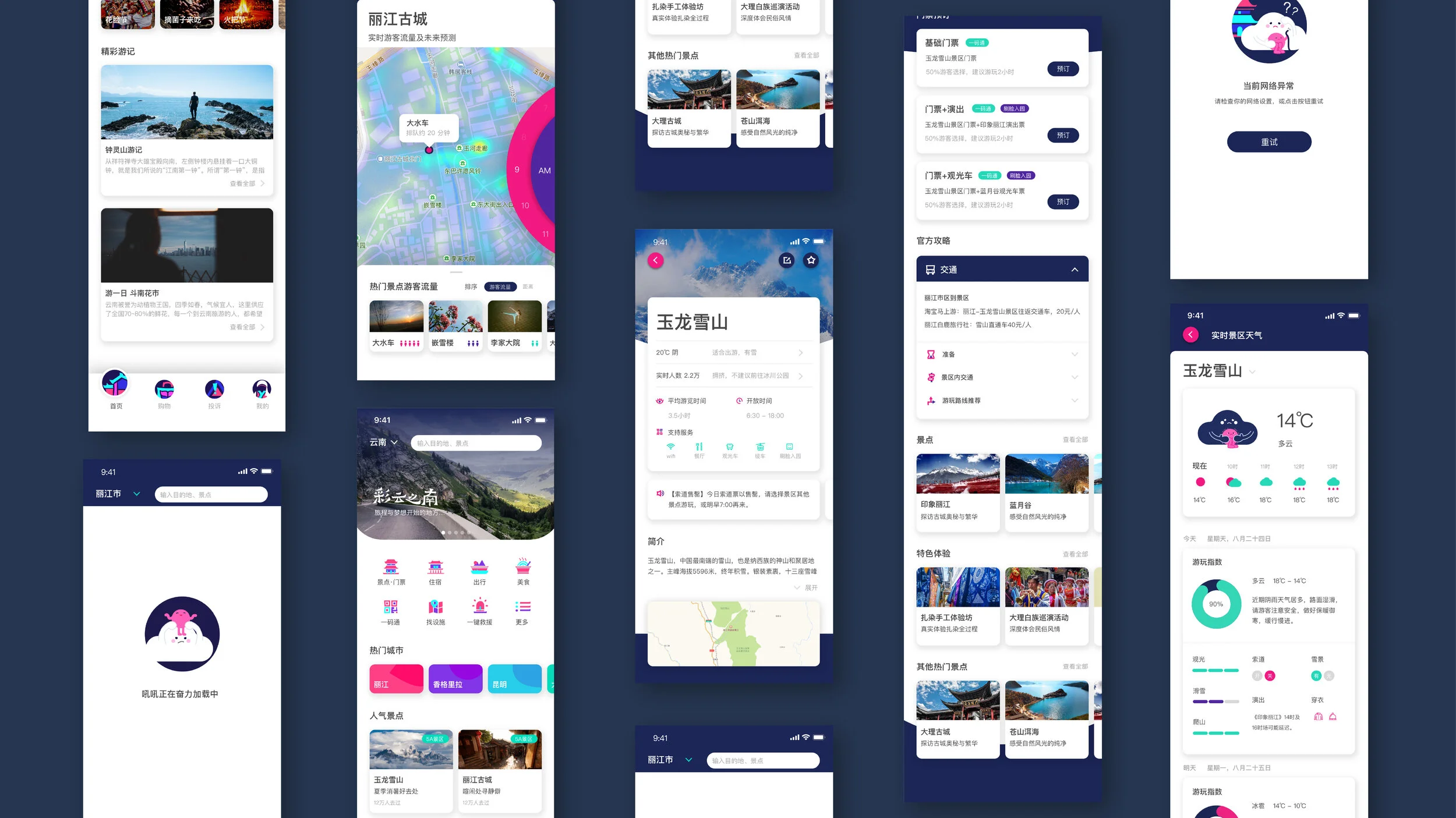
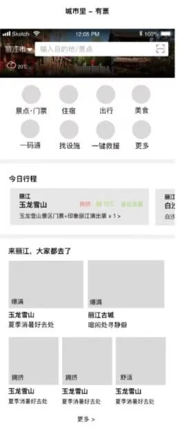
Low Fidelity Prototype

Visual identity redesign
“guarantee” and “convenience” are the two central keywords for the overall App optimization. The interaction redesign is to make the app more convenient, and the visual redesign will have a more in-depth exploration of “guarantee.”
Objective
- Based on Keywords “secure” and “cultural uniqueness.” redesign the existing brands.
- Let users feel the guaranteed service provided by the local government, and break the local government’s serious visual stereotype.
- Make users feel immersive in cultural visual impressions and comfortable interface experience.
- From the two aspects of [guarantee: “credibility and guarantee”] [convenience: free from worry, reduce effort, saves time”] to encourage domestic tourists travel to Yunnan.
- Future outlook: We hope to lay the foundation for the development of local culture through the optimization of app brand and visual image. We hope that while changing the visual interface, we can connect online interface and offline advertisements together and let visual identity become the intellectual property of Yunnan tourism in the future.
During the design research, we will make sure to combine the unique local terrain, climate, tourist routes, cultural features and architectural elements to integrate with the fragmented urban characteristics. Therefore to create a pioneering brand identity that can arouse the curiosity of tourists.
Visual Positioning
Yunnan Province Positioning & Characteristics
“spring cities“, varied landscape: snow-capped mountains, rice terraces, lakes and deep gorges.
The region is also known for its large number of ethnic minorities.
Competitive cities
- Hunan: Zhangjiajie
- Anhui: Huangshan
- Fujian: Wuyi mountain
- Zhejiang: Yunhe Terrace
Competitive culture
- Phoenix, Hunan
- Guilin, Guangxi
After finding the competition points, we must find out the unique advantages of Yunnan as an available promotional element for visual brainstorming.
Visual inspection of existing App
Existing design
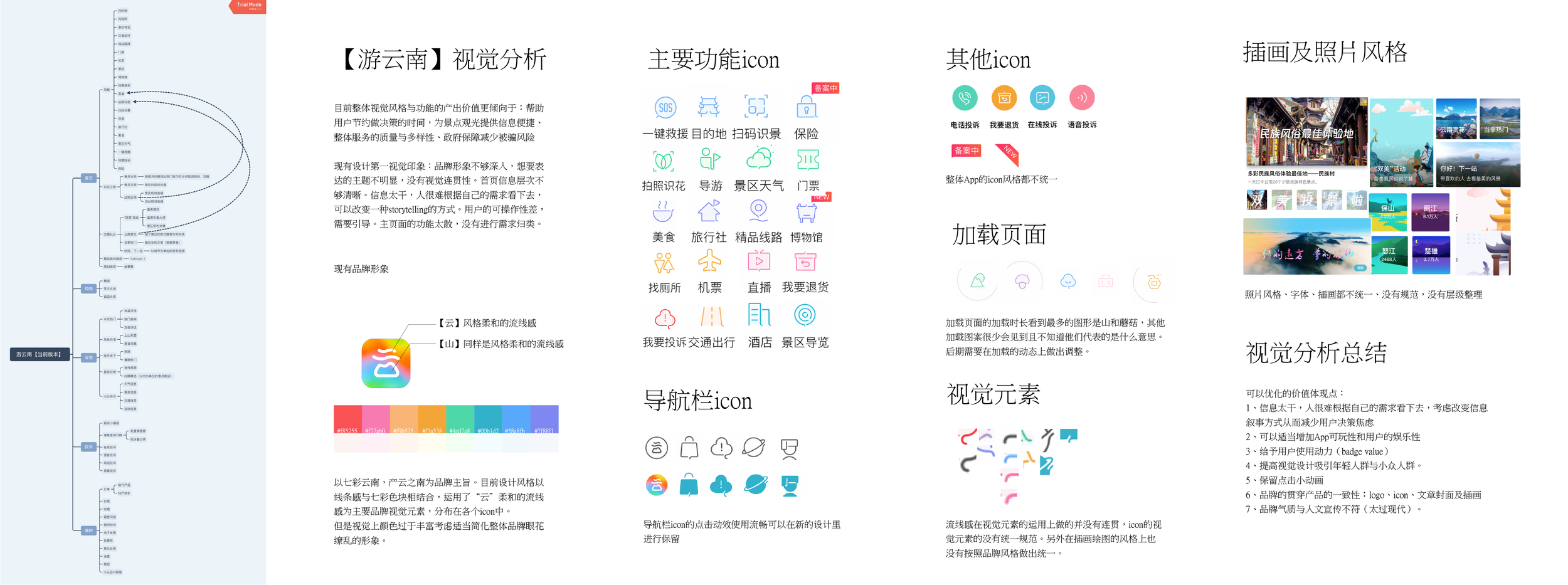
Visual inspection With [colourful Yunnan七彩云南] as the central theme of the brand, the current design style combines line and bold colour blocks, which are distributed in various icons. It uses the soft and fluid element of “cloud” as the leading brand visual identity.
Disadvantages
- Interfaces have widely use of vibrant colours, consider appropriately simplifying the dazzling feeling of the overall brand.
- Typesetting is not clear.
- Mountains and mushrooms most often seeing icons, and other icons convey fuzzy information.
- There is no coherence in the use of visual elements, there is no UX standard, and the style of illustrations has not adequately selected according to the brand image.
**Opportunities **
- Optimize the image that is too colourful and modern, and at the same time, express the concept of “guarantee.”
- Consistency of brand visual elements and interface.
- Visual changes: Interface optimization for visual elements such as colour system, logo, icon, spacing, etc
Visual Research
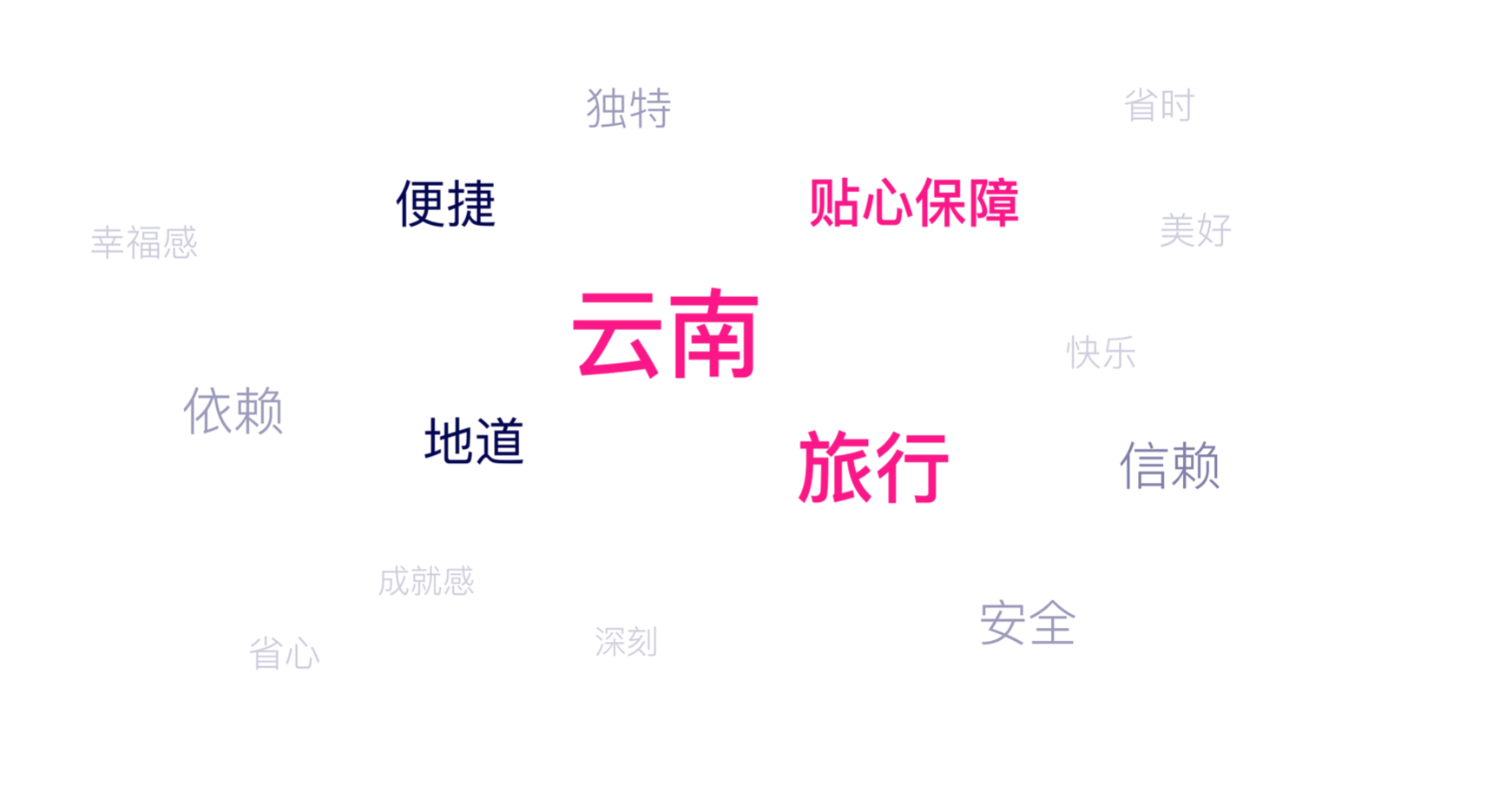
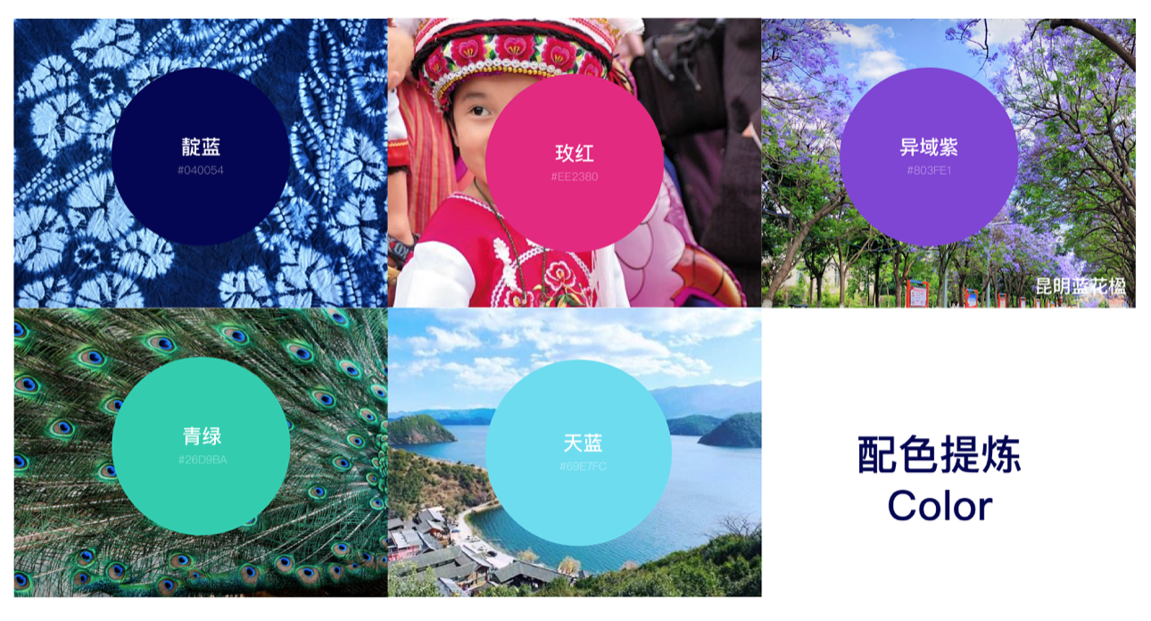
Through primary research, we put together fragments of various cultural elements in Yunnan.
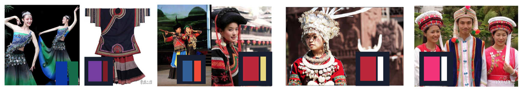
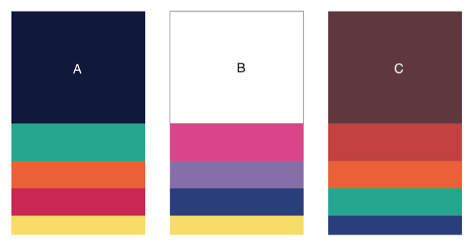
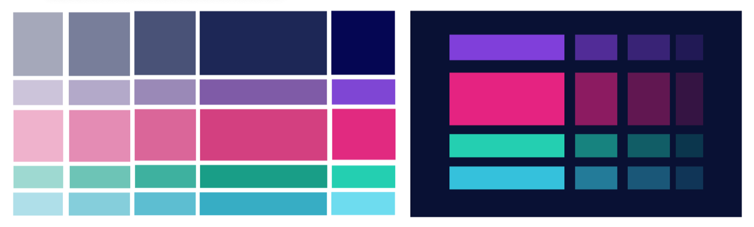
 Most Yunnan colour palette
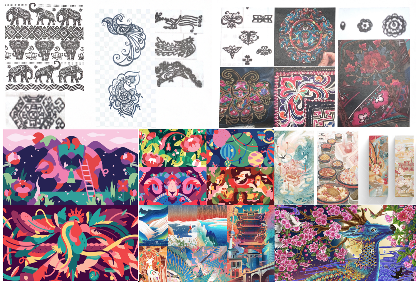
Most Yunnan illustration style
Most Yunnan elements
Conclusion
Through interviews and surveys with different groups of people, we found that people are more inclined to use animal and plant symbols as the main visual element of Yunnan. Among them, the highest number of votes are: peacocks, elephants, flowers (patterns) and butterflies.
Judging from the results of the illustration style, the highest number of votes was the flat geometric style. The main reason is the colour block stitching has the ruggedness of outstanding original school of art, and it is easy to remind people of the simple folk style of ethnic minorities and the high-saturation homochromatic colour blocks in embroidery culture.
Through further meticulous cultural analysis, we finally extracted the embroidery elements and tried to integrate flat shapes, large colour blocks, simplicity, and roughness into our App interface design.
Keywords: flat shapes, large colour blocks, simplicity, roughness
Style Customization
Step 1 Keywords: Yunnan, guarantee, travel
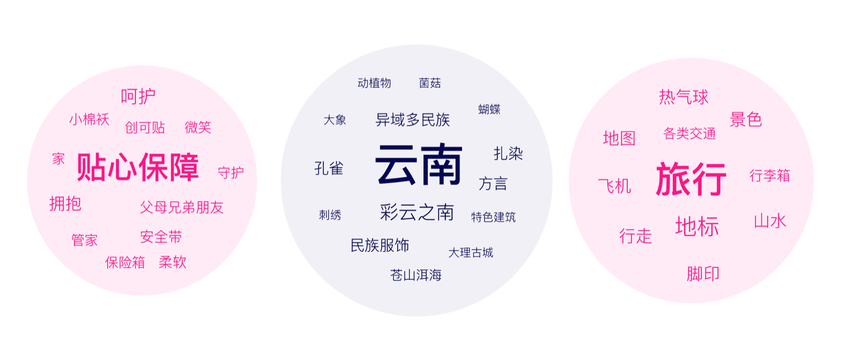
Step 2 brainstorm visual element ideas for step 1
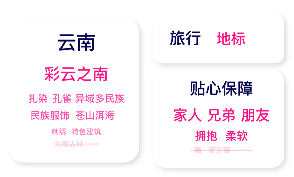
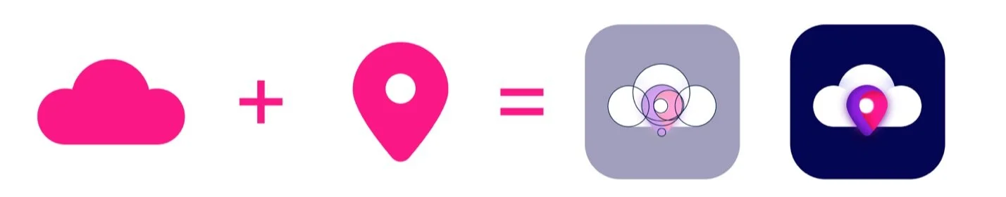
Step 3 Selected visual elements for the keywords
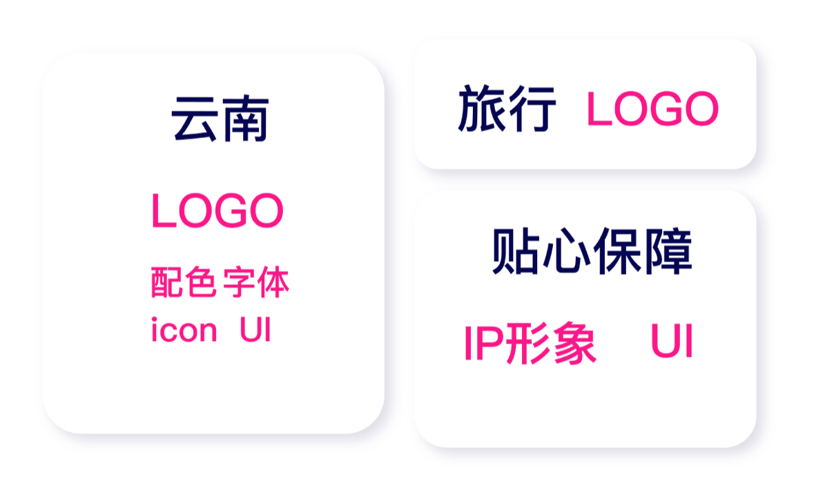
Step 4 Chose the most appropriate visual container for the visual elements Result = Keywords + Visual elements + Visual Container
- Yunnan + cloud, peacock + logo, colour palettes, icon, UI
- Guarantee + family, siblings, friend, hug, soft/puffy staffs + A caring character, UI
- Travel + map, place mark + logo, UI
Brand Design
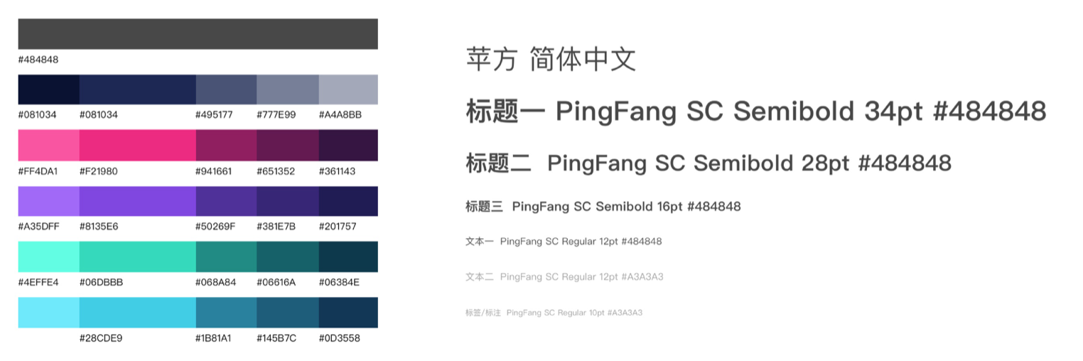
Color Palette
 Brand Colour
 Logo
Logo
 Mascot Design
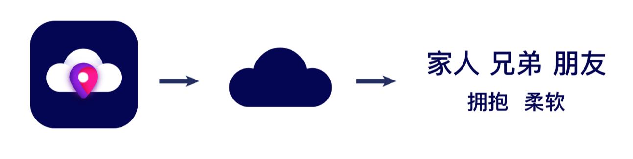
Combination of the logo and visual elements from “guarantee“.
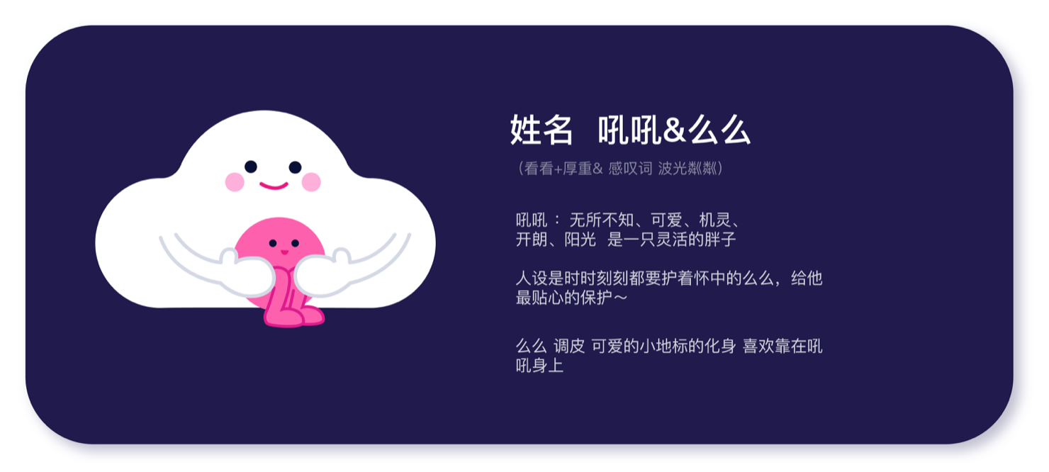 **Let’s meet Ho’ho & Me’me ! **
Hoho (cloud)
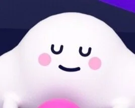
Hoho means “look” in Yunnan dialect Knowing everything, cute, smart, cheerful, a flexible puffy cloud. Always guard Meme in its arms and give Meme the most intimate protection. Meme (place mark)
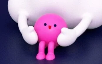
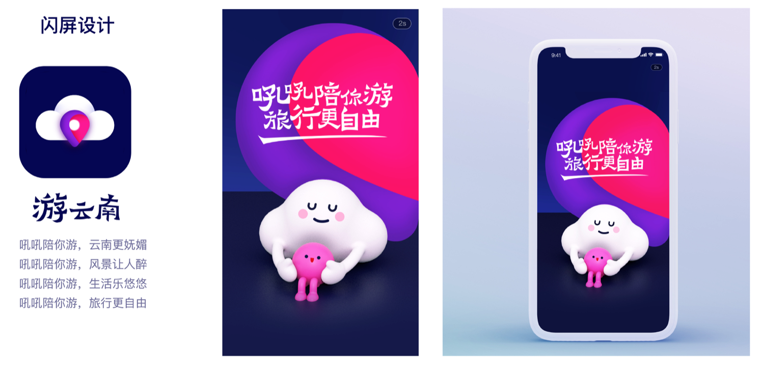
Meme means “wow & sparkling“ in Yunnan dialect. Avatars of the place mark Naughty and cute, like to lean on Hoho App Launch Screen Design
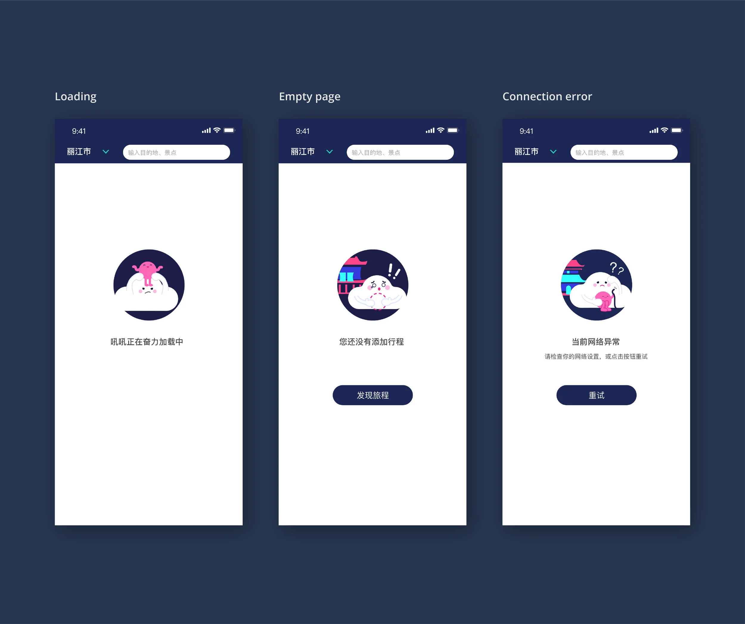
 Installations in App
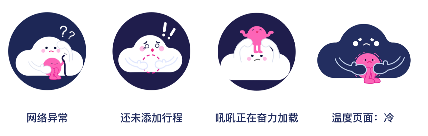 Lost wifi connection Schedule is empty Loading Weather icon: Cold
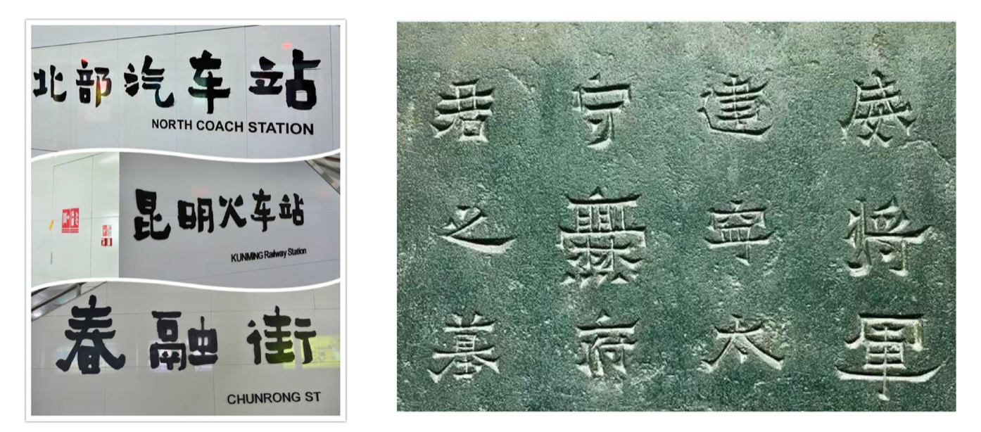
Typeface Design
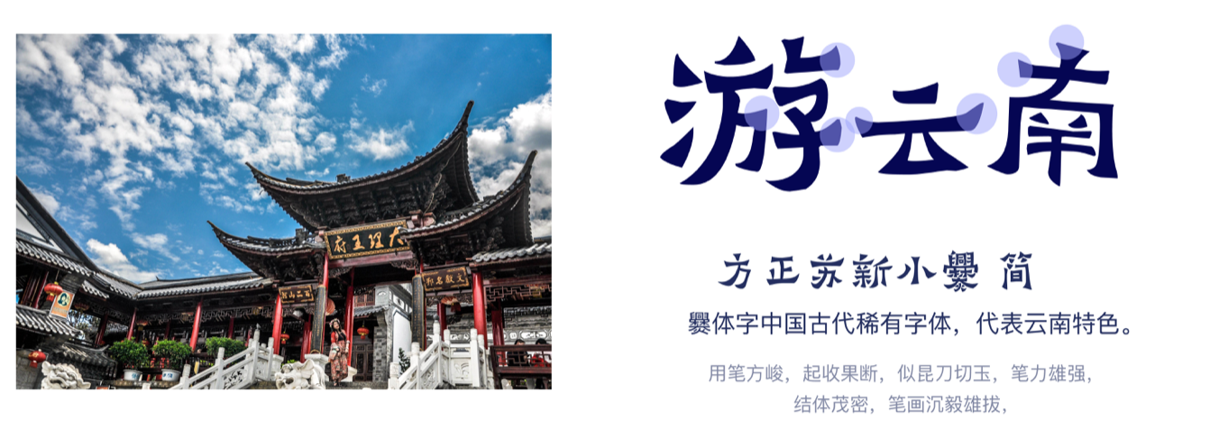
We generate visual elements from Yunnan architectures and Chinese traditional typography: “XiaoChuan”.
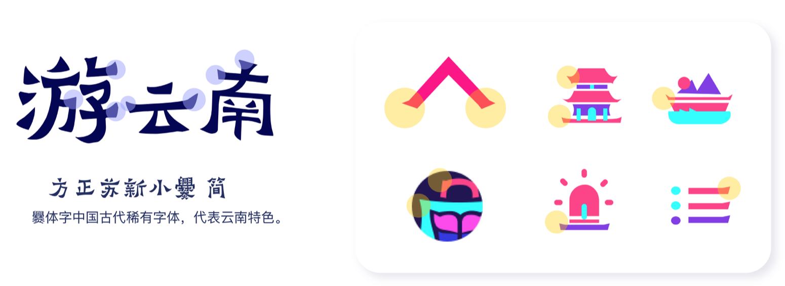
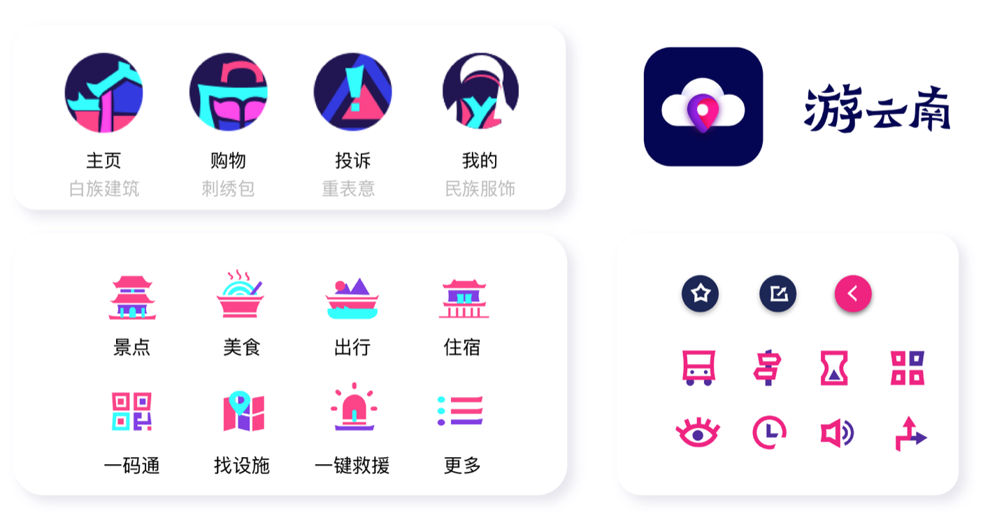
Applications on typeface and icons Icon Design
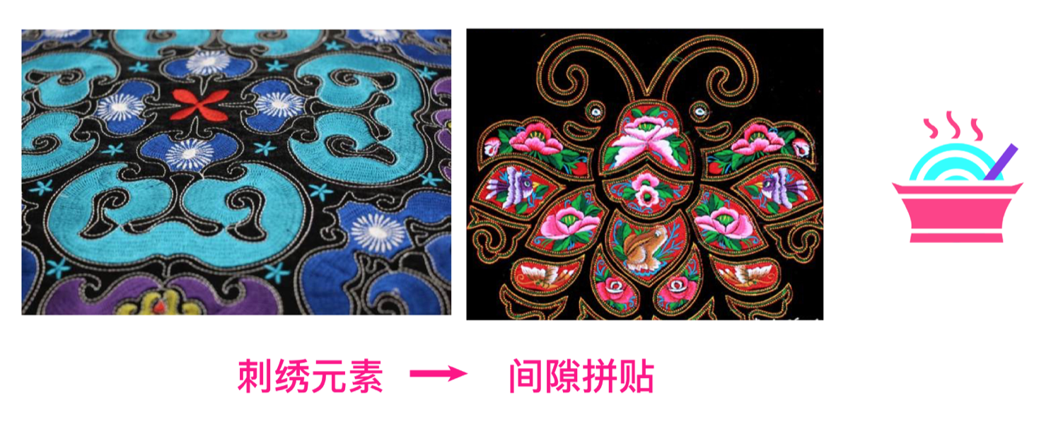
Inspired from Yunnan embroidery
 UI Color Palette & Typeface
 UI Elements
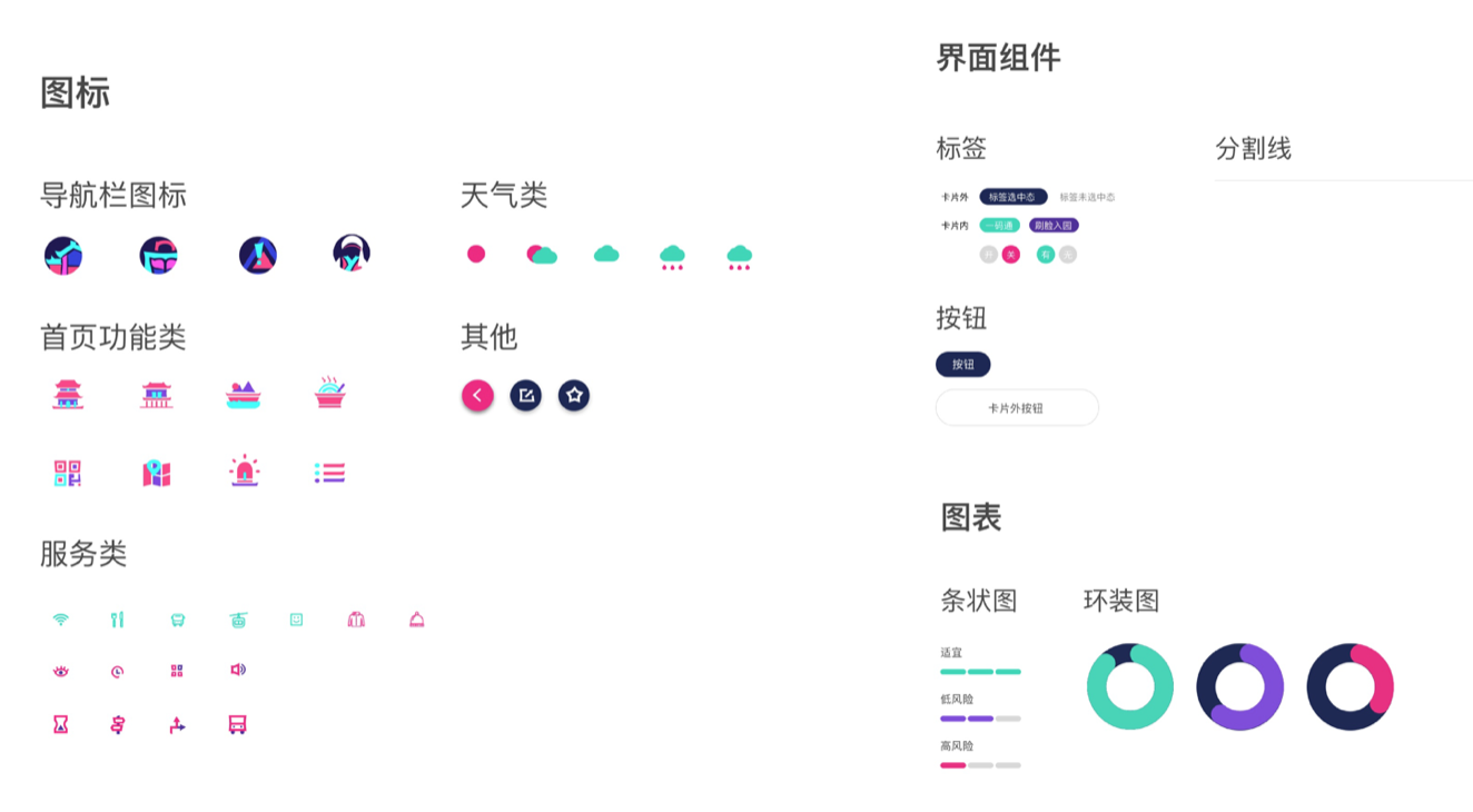
Interface Design
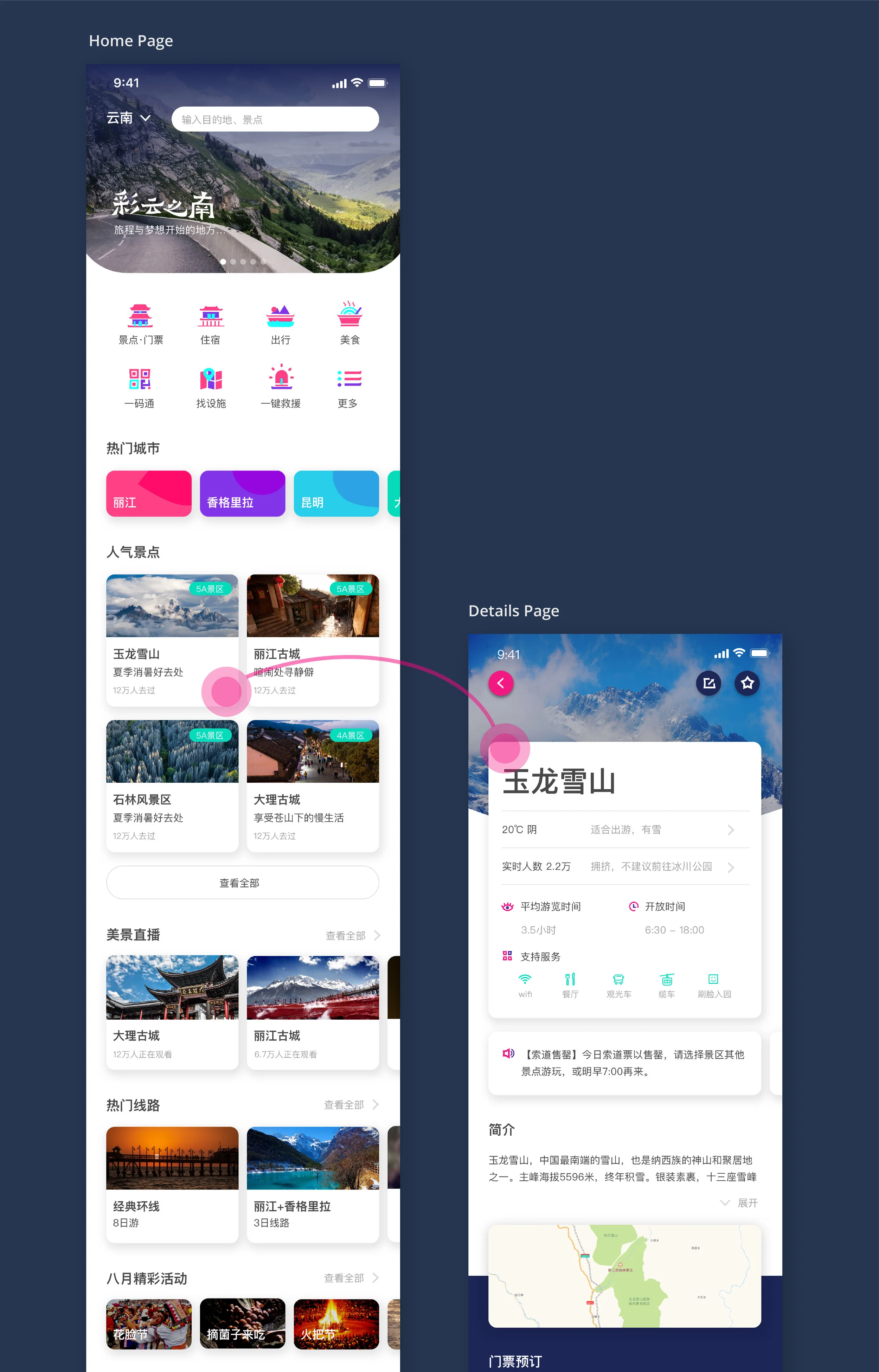
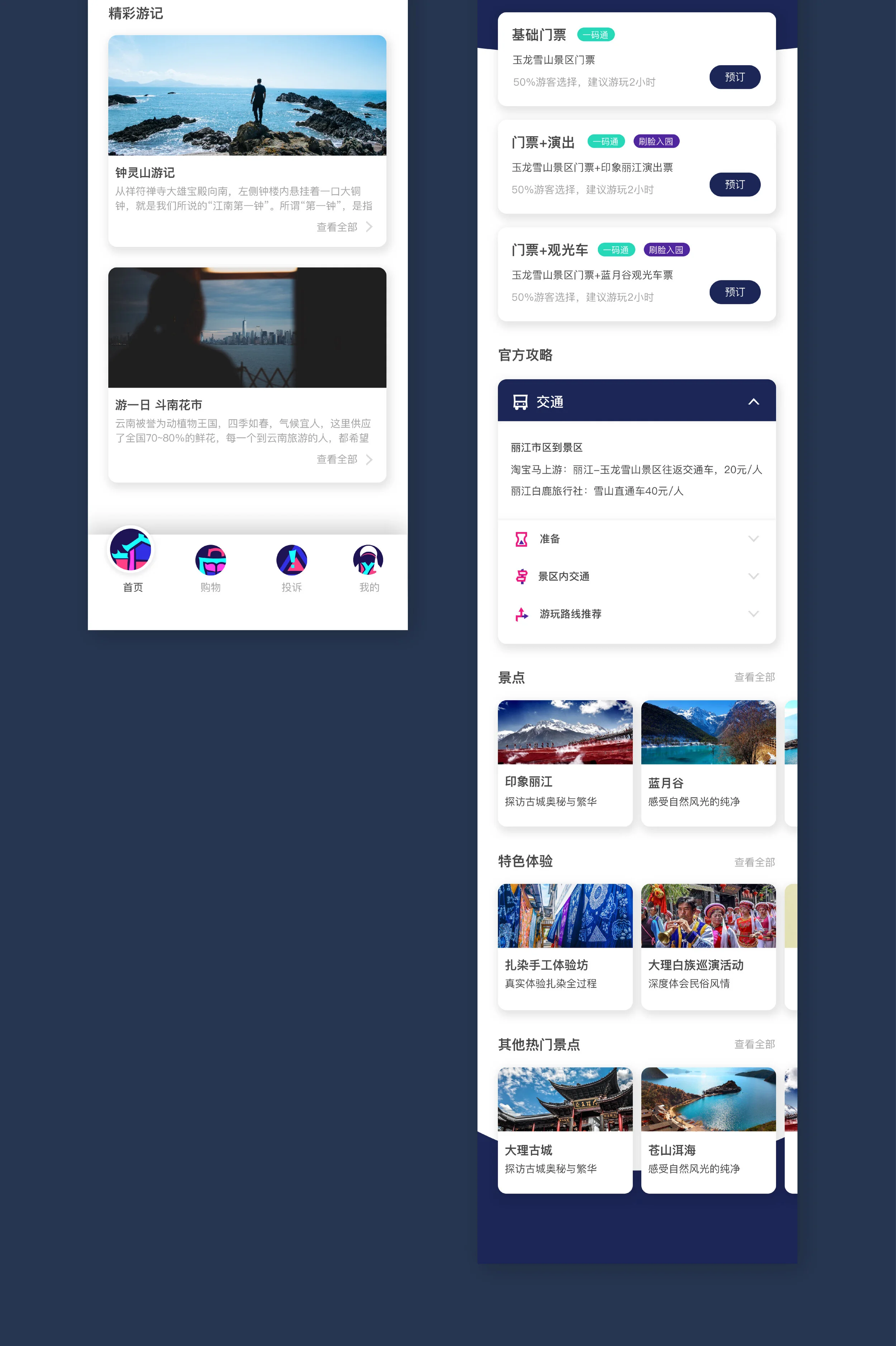
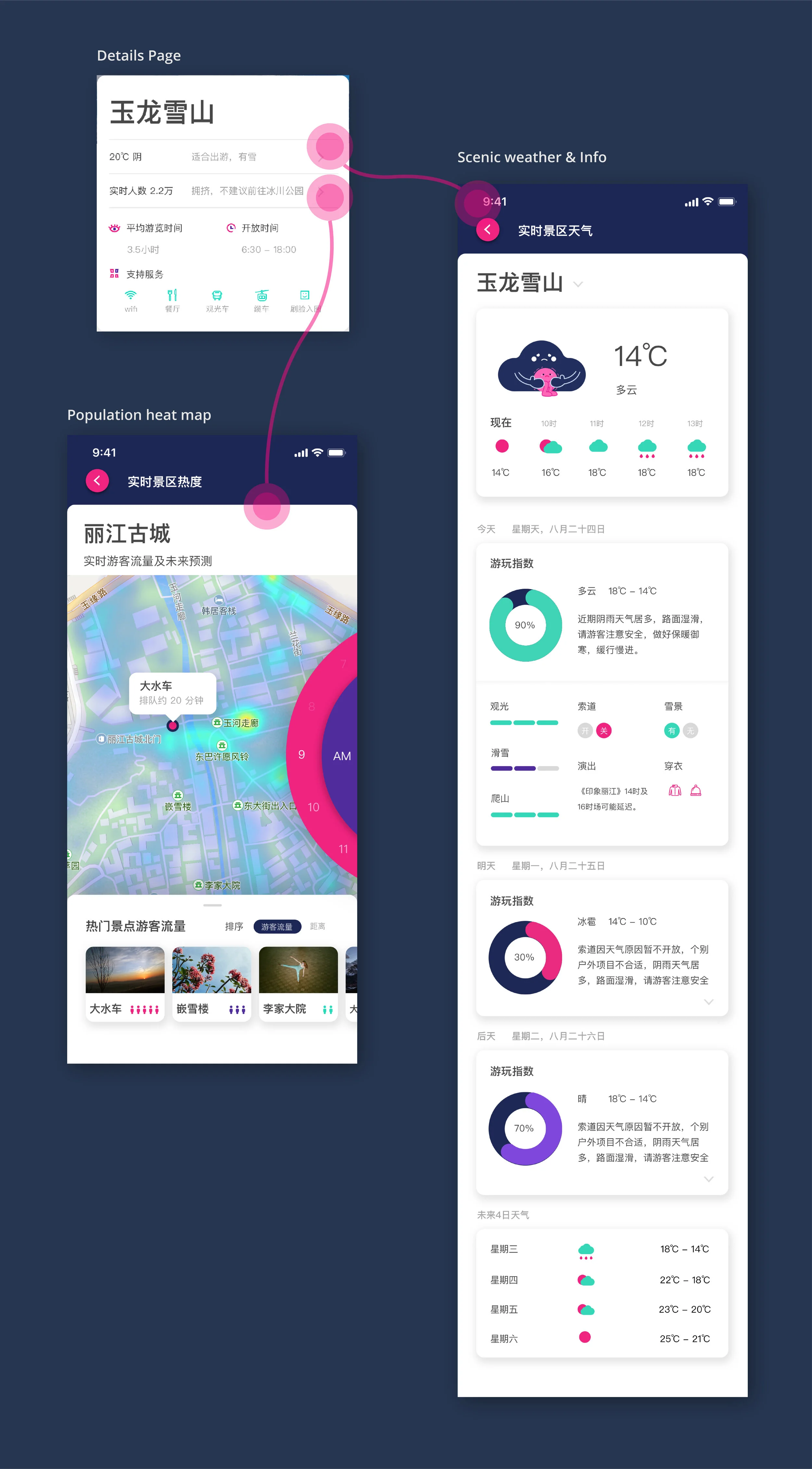
Let’s explore the prototype!
Project Reflection
I am thrilled to do this intern project with beautiful and professional team members, and I m even happier is that the project developers formally adopted some of our proposals to the project.
In these two weeks, I have a more profound perception of how to connect product demands with users’ needs and have become more aware of adding emotional designs to the user interface reasonably. Being able to complete such a comprehensive design project in two weeks is inseparable from our time management and perfect task distribution.